How to Make a Linear Plot using Microsoft Excel 2010
To show a linear relationship using Excel, such as density, complete the following steps:
- Enter a set of values in column A.
- Enter a set of values in column B.
- Set the data range by selecting all the data. (Click in a corner and drag the mouse until all boxes are selected. Do NOT include the titles.)
- Click the Insert tab. In the charts menu, click on Scatter. Select the first option, scatter with only markers.
- Right click on the graph, and select Select Data. Click on Series1 (on the left) if it is not already selected, and press the Edit button just above it. Make sure the proper X and Y values are selected. (If you put Y as column A and X as column B, this will be done automatically. If X and Y are backwards, re-select the values on this window.) For example, on a density plot the mass should be on the Y-axis, and volume on the X-axis.
- At the top, there will be a green area labeled Chart Tools. Select the Layout tab. Click on Axis Titles in the Labels submenu. Enter the titles for both axes. Don’t forget the units! (Use rotated on the vertical axis.) Also, select Chart Title to add a title for the entire chart.
- To draw a straight line thru the data, right click on a data point, and select "Add Trendline".
- Select Linear regression. If the plot is to go thru the origin, check the "Set Intercept" box, and enter 0 in the box. To show the equation of the line (y=mx +b), check the "Show Equation" box. If you want to discuss the R2 value, select it as well.
- Move objects around so they are clearly visible. Make any final adjustments to make the graph clear and readable. You can adjust the axis properties by right clicking on the axis, and select Format Axis.
- Be sure the plot takes up most of the space. Right click on the chart, and select Format Chart Area. Then, select Size.
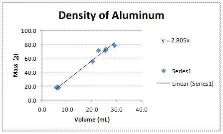
Here is a sample density plot from class data obtained by an AP Chemistry class.
To calculate the density column, enter the formula "= B2/A2" to divide the mass by the volume in the first box (C2). Click on that box, and drag down to the bottom of the data. On the Home screen, at the far right in the Editing menu, select "Fill" and "Down". The spreadsheet will automatically change the row numbers in the formula for each entry.
Excel 2003 (or previous)
To show a linear relationship using Excel,
such as density, complete the following steps:
1. Enter the X values in column A.
2. Enter the Y values in column B.
3. Press the chart button in the toolbar, OR under Insert in
the menu, select Chart.
4. Select plot type "XY scatter". Press
<Next>.
5. Set the data range by selecting all the data. (Click
in a corner and drag the mouse until all boxes are selected. Do NOT include the
titles.)
6. Click on the Series tab. Make sure
the proper X and Y values are selected. (If you put X as column
A and Y as column B, this will be done automatically. In any case,
make sure the values next to X-axis reflect the location of the X values
on the spreadsheet, and the values next to Y-axis reflect the location
of the Y values.) For example, on a density plot the mass should
be on the Y-axis, and volume on the X-axis. Press <Next>.
7. Fill in the titles. Don't forget to list the
units! Press <Next>.
8. Press <Finish>.
9. To draw a straight line thru the data, under Chart in the
menu select "Add Trendline".
10. Select Linear. Press the Options tab.
11. If the plot is to go thru the origin, check the "Set
Intercept" box, and enter 0 in the box.
12. To show the equation of the line (y=mx +b), check the
"Show Equation" box. Press <OK>.
13. To change the scale to make the plot take up most of the
space, right click on a gridline and select "format gridline". Enter the
changes for the x or y axis as needed.
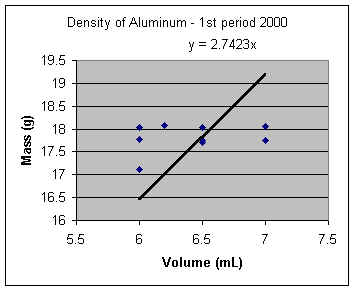
Here is a sample density plot from class data obtained by a past AP Chemistry class.
Calculating the Density Automatically
To calculate the density column, enter the formula "=
B2/A2" to divide the mass by the volume in the first box (C2). Click on that
box, and drag down to the bottom of the data. Under the Edit menu, select
"Fill" and "Down". The spreadsheet will automatically change
the row numbers in the formula for each entry.
To set the significant digits on each box, right click on the box and select "Format Cells". Then on the number tab, under category select "Number". Then you can set the number of decimal places displayed. You can select a group of numbers, and then format them all at once as well.
|
A |
B |
C |
1 |
Volume |
Mass |
Density |
| 2 |
6.0 |
17.12 |
2.853333 |
| 3 |
7.0 |
17.76 |
2.537143 |
| 4 |
6.2 |
18.08 |
2.916129 |
| 5 |
7.0 |
17.76 |
2.537143 |
| 6 |
6.5 |
17.75 |
2.730769 |
| 7 |
6.0 |
17.77 |
2.961667 |
| 8 |
7.0 |
18.05 |
2.578571 |
| 9 |
6.0 |
18.03 |
3.005 |
| 10 |
6.5 |
17.7 |
2.723077 |
| 11 |
6.5 |
18.04 |
2.775385 |
Finding the mean (for the copper portion of the lab)
To find the mean of the data, select a blank box and enter this formula in the f(x) box at the top of the screen: =AVERAGE(C2:C11), where the C2 and C11 are the first and last data point location.
For Office 2007 (BETA)
How to make an XY Scatter Graph with linear regression and equation
1. Enter the X values in column A.
2. Enter the Y values in column B.
3. Set the data range by selecting all the data. (Click
in a corner and drag the mouse until all boxes are selected. Do NOT include the
titles.)
4. Select from the menu: Insert > Charts > Scatter > Scatter with only markers.
5. Click on the graph to activate the Chart Tools menu, which should appear in green at the top right of Excel. Choose the Design tab of the Chart Tools menu. Under Layout, select #9.
6. Substitute the sample text for the correct labels on the title and the axes by clicking on each title on the graph. Don't forget the units!
7. Delete the key/legend since you are showing only one series.
8. Right click on the chart, and select "Select Data". Make sure Series 1 is selected, and press the edit button. Make sure
the proper X and Y values are selected. (If you put X as column
A and Y as column B, this will be done automatically. In any case,
make sure the values next to X-axis reflect the location of the X values
on the spreadsheet, and the values next to Y-axis reflect the location
of the Y values.) You can type in the data range, or you can press the button at the right end of each entry box. This button will allow you to select the data on the spreadsheet using the mouse. For example, on a density plot the mass should
be on the Y-axis, and volume on the X-axis.
9. Right click on the line in the chart, and select Format Trendline. If the plot is to go thru the origin, check the "Set
Intercept" box, and enter 0 in the box. You can also check or uncheck the "Show Equation" box and "Display R-squared value on chart" boxes as needed.
10. If you need to adjust the axes spacing or significant digits, right click on the axis you want to modify and select "Format Axis".
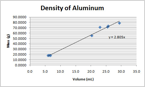
Here is a sample density plot from class data obtained by a past AP Chemistry class.
Calculating the Density Automatically
To calculate the density column, enter the formula "=
B2/A2" to divide the mass by the volume in the first box (C2). Click on that
box, and drag down to the bottom of the data. Under the Edit menu (on the right), select
"Fill" and "Down". The spreadsheet will automatically change
the row numbers in the formula for each entry.
To set the significant digits on each box, right click on the box and select "Format Cells". Then on the number tab, under category select "Number". Then you can set the number of decimal places displayed. You can select a group of numbers, and then format them all at once as well.
|
A |
B |
C |
1 |
Volume |
Mass |
Density |
2 |
6.0 |
17.12 |
2.853333 |
3 |
7.0 |
17.76 |
2.537143 |
4 |
6.2 |
18.08 |
2.916129 |
5 |
7.0 |
17.76 |
2.537143 |
6 |
6.5 |
17.75 |
2.730769 |
7 |
6.0 |
17.77 |
2.961667 |
8 |
7.0 |
18.05 |
2.578571 |
9 |
6.0 |
18.03 |
3.005 |
10 |
6.5 |
17.7 |
2.723077 |
11 |
6.5 |
18.04 |
2.775385 |
Finding the mean (for the copper portion of the lab)
To find the mean of the data, select a blank box and enter this formula in the f(x) box at the top of the screen: =AVERAGE(C2:C11), where the C2 and C11 are the first and last data point location.
Back to Chemistry Geek Home Page |